 |
 |
|||||||
 |
 |
|||||||
 |
||||||||

the GREEN_BLUE_BLUE series
The program:
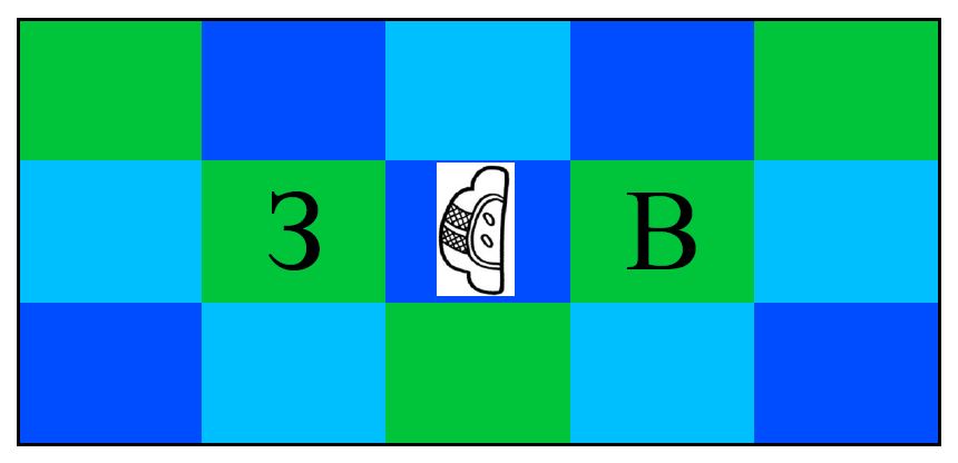
Technically, this series is really just named by the colors themselves, with no actual language getting in the way—the "translation" of these colors into your preferred language is part of the point. The titles of the pieces in this series are (mostly) just images that feature the colors. For example, one of the simplest is also the first one written:

Obviously, we could assign a unique term to these precise colors, either by using more technical color terms from the worlds of fashion or painting, or, if no appropriate term existed, we could just invent one. However, human languages always have certain core, foundational color terms that are used in more basic situations. Wow, this is surprisingly hard to say; let's just use these colors as an example. In most day-to-day situations, I would describe the three colors in these boxes as one shade of green, and two different shades of blue. Or, similarly, I might say that these colors are green, dark blue and light blue. So, as a native English speaker, I see these three boxes as using two fundamental colors, but with one of them represented in two different variants.
There's nothing magical about this particular division however. There are some languages, especially older versions of languages like ancient Mayan or Japanese up to the early 20th century, which would describe all three of these colors as belonging to the same fundamental family of colors. Whereas my gut response is to say there are two colors with one represented by two shades, their gut response would be to say there is only one color represented by three different shades. For instance, an ancient Mayan would say that there are three different shades of Yax, or a 19th-century Japanese speaker might say there are three different shades of 靑 (Ao). We have to be very careful here: when European colonists came upon cultures like this, they came to incredibly ignorant conclusions about the people's ability to see different colors at all. They would condescendingly bemoan the poor ignorant native speakers that "couldn't see" the difference between green and blue. This is 100% false; a person with standard vision can easily see the difference between the colors, and, for that matter, could easily use a more specific term if they wanted. This is just a purely linguistic issue about how colors are broken down into fundamental categories, and no particular division is inherently better or more useful than another. This is most easily seen by taking a look at native Russian speakers, and imagining a potentially consciousness-raising alternative history.
A Russian speaker would have yet a different response to the three color boxes than a modern English speaker or an ancient Mayan speaker, because they would describe the boxes as containing three fundamental colors. Rather than three different shades of yax, or one shade of green alongside two shades of blue, they would see the three basic colors зелёный (zielioniy), синий (siniy) and голубой (goluboy). These last two terms are every bit as foundational in Russian terminology as our terms red, blue and purple. Now imagine an alternate reality in which Russian colonists came upon an English-speaking community and ran tests on them, coming to the sad conclusion that those poor English speakers can't see the difference between синий and голубой. If you're an English speaker, you'd object that of course you can see the difference, and you might even offer new terms, such as "navy" and "aqua," to describe them. How one's languages divides the world of color by default is irrelevant to one's ability to see. (There are, however, some interesting experiments involving the speed with which English speakers differentiate light blue and dark blue versus the speed with which Russian speakers distinguish them. Look up the "Russian blues" experiment if you're curious)
And but so anyway, the program of these pieces is inspired by thinking about the ways we divide continuous phenomena into discrete vocabularies, and by the idea that we can slip seamlessly between seeing something as three different things or mild variations of a single theme, just by shifting our perspective.
The structure:
Pieces in this series:
PortRait of the ArTist,**NYC2001
Solo Cello and Recorded Electronics
Summer '01
more info
Note: Unlike most earlier series, there is no indication of order in these titles. In fact, almost all of them are named by some image that includes the three titular colors.


